Work

About
Resume
POS Redesign
Tommy Hilfiger • Pitched June 2025 • UX/UI Design & Research
PROJECT OVERVIEW
Too long, didn’t read
What was the problem?
An outdated POS system that confused both cashiers and customers, negatively impacting the business's transaction speed.
What was my solution?
I synthesized first hand research, user interviews, and a UX audit into high fidelity mockups for a new POS along with tweaks to the checkout process as a whole
Did my solution work?
-50%
TOTAL TRANSACTION TIME
-85%
CLICKS IN KEY USER FLOWS
I pitched the redesign to management and received heavy praise but ultimately, Tommy Hilfiger took no action to implement the improved POS
BACKGROUND
Going from Sales Associate to UX Lead
Tommy Hilfiger uses an outdated POS that, in short, sucks...
- Adding a 10¢ bag fee takes 7 clicks.
- The cashier can’t see how much discount items have.
- Customer’s can’t type input phone numbers, only email.
As a designer using the software for 8 hours a day, I couldn’t ignore it. Every time a customer sighed at the wait, I saw an opportunity.
A POS (Point of Sale) is a monitor or tablet, attached to the register, used to facilitate transactions.
RESEARCH
On-site interviews and data collection
I didn’t get approval to run company-wide surveys or conduct formal interviews, so I had to make due with the research I could gather while working my usual shifts.

Conversations (informal interviews) with coworkers

Intentional observation of the checkout interaction

Self-recorded data of customer behavior and patterns
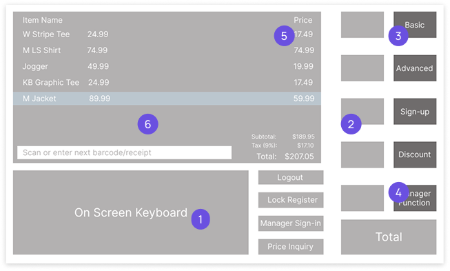
UX AUDIT
What wasn’t working and why?
- On-screen keyboard: It’s not used, we already have a physical keyboard, and it takes up a fourth of the screen
- Two tiered menu: Requires cashiers to navigate, extra clicks slow down checkout
- Unclear category names: The titles don’t describe what functions are inside
- Unused functions: An average transaction doesn’t use most of what’s visible on screen
- Discount percentage: Promo not shown, cashiers must manually calculate discounts
- Light mode: Cashiers stare at this screen for 8 hours at a time, consider eye-strain
DESIGN PROCESS
Turning pain points into intuitive flows
I synthesized my research into two lists which became the basis of all my design decisions in this project
Using a list of the most commonly used functions, I established a clear information hierarchy which laid the groundwork to rearrange the main dashboard
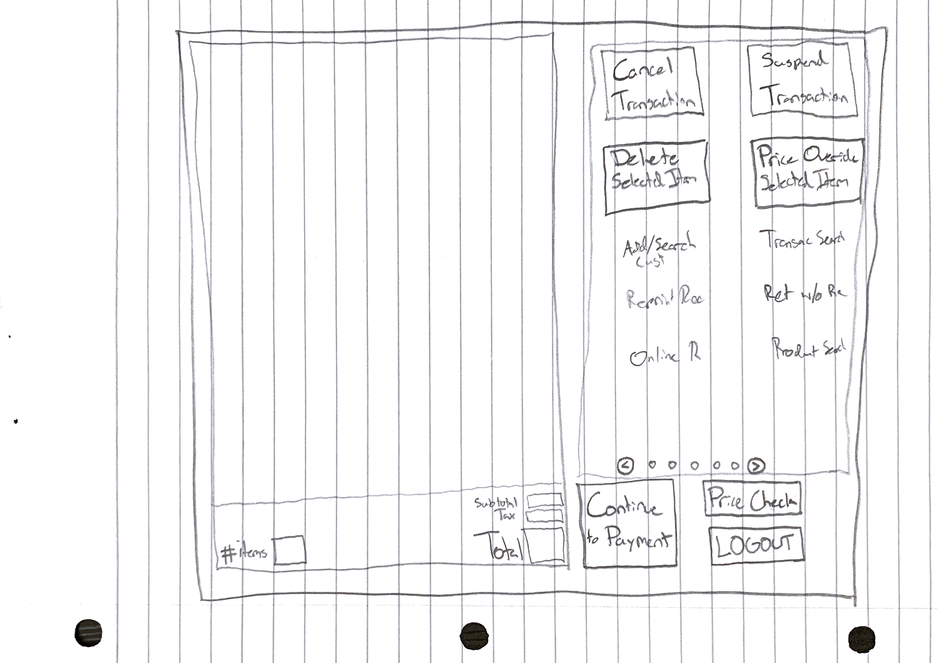
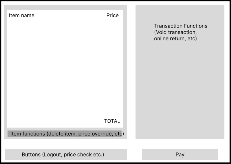
Using a list of cashiers’ biggest pain points, I went beyond the dashboard and redesigned the checkout as a whole to be more efficient. Specifically, the 10¢ bag fee flow and the Hilfiger Club sign up process
Old
Scan and fold items
Hilfiger Club
Payment
“Hello did you find
everything alright?”
“Thank you,
have a nice day!”


Scan and fold items
Payment
“Hello did you find
everything alright?”
“Thank you,
have a nice day!”


Hilfiger Club
New
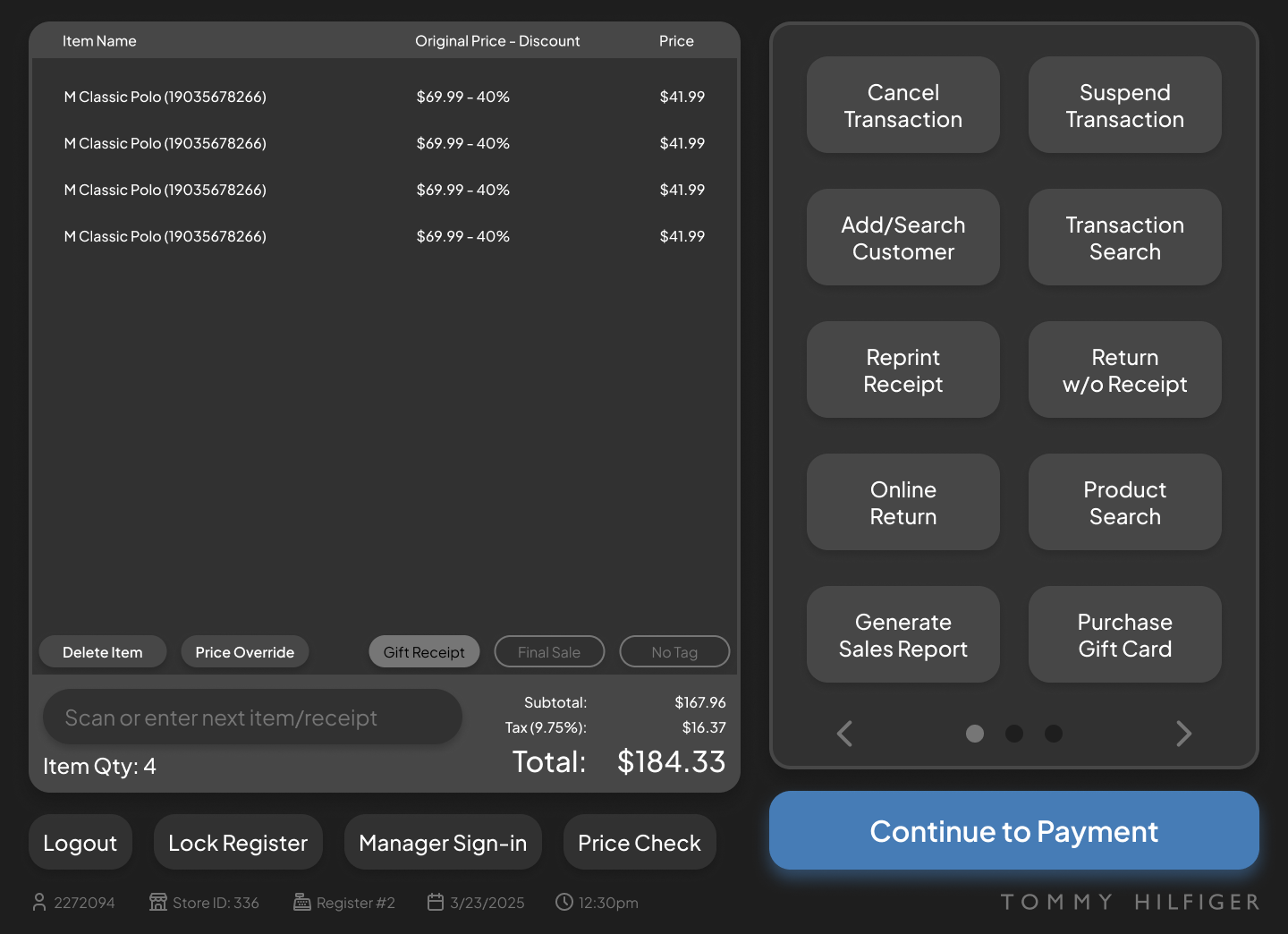
KEY IMPROVEMENTS
A clearer, faster product that empowers cashiers


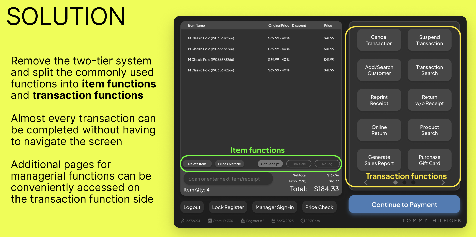
No more two-tier menu
Only the most important buttons are visible
and organized into Transaction and Item
Functions
Added toggleable Item
Functions
Items that are final sale or missing tags can
be flagged, no more manually marking the
receipt
Unknown discount percentages
Discount percentage is shown instead of
just the original and current price
Improved content design
Renamed functions increase accessibility
for all users.
Dark Mode
Reduces eye strain for long shifts.


Adding a bag fee now only takes one click instead of seven – an 85% reduction that will affect 44% of transactions
OUTCOMES
Great results & great feedback, but ultimately no action
-50%
TOTAL TRANSACTION TIME
-85%
CLICKS IN KEY USER FLOWS
I presented my findings to store-level management who applauded my efforts, showed interest in the redesign, and gave the go-ahead to pitch it to corporate. I got positive feedback from the head of HR who connected me to the North American Retail Operations team to which I’ve reached out multiple times but got ghosted.
“During Black Friday or the holiday rush we have to do line-control. If checkout was faster, we could let more customers in to the store at a time and we would increase total profits ” -Store Manager
“This is awesome, right now we are using a program that’s like
10 years old” -Sales Lead
REFLECTIONS
Designing for cashiers, by cashier(s)
I didn’t make user personas—
I worked alongside them
I didn’t search for data—
I recorded it in real time
I didn’t make an empathy map—
I clocked in
Even though the redesign didn’t cause the company-wide change that I hoped for, it was still a successful redesign. Its biggest strength was that every decision was informed by its prospective users. The stark difference between the original POS and my redesign makes me wonder if the original developers even consulted cashiers.
More about me
See all my work
© 2025 Tommy Agarwal. All Rights Reserved.
Tommy Agarwal

Work
About
Resume
POS Redesign
Tommy Hilfiger • Pitched June 2025 • UX/UI Design & Research
PROJECT OVERVIEW
Too long, didn’t read
What was the problem?
An outdated POS system that confused both cashiers and customers, negatively impacting the business's transaction speed.
What was my solution?
I synthesized first hand research, user interviews, and a UX audit into high fidelity mockups for a new POS along with tweaks to the checkout process as a whole
Did my solution work?
-50%
TOTAL TRANSACTION TIME
-85%
CLICKS IN KEY USER FLOWS
I pitched the redesign to management and received heavy praise but ultimately, Tommy Hilfiger took no action to implement the improved POS
BACKGROUND
Going from Sales Associate to UX Lead
Tommy Hilfiger uses an outdated POS that, in short, sucks...
- Adding a 10¢ bag fee takes 7 clicks.
- The cashier can’t see how much discount items have.
- Customer’s can’t type input phone numbers, only email.
As a designer using the software for 8 hours a day, I couldn’t ignore it. Every time a customer sighed at the wait, I saw an opportunity.
A POS (Point of Sale) is a monitor or tablet, attached to the register, used to facilitate transactions.
RESEARCH
On-site interviews and data collection
I didn’t get approval to run company-wide surveys or conduct formal interviews, so I had to make due with the research I could gather while working my usual shifts.

Conversations (informal interviews) with coworkers

Intentional observation of the checkout interaction

Self-recorded data of customer behavior and patterns
UX AUDIT
What wasn’t working and why?
- On-screen keyboard: It’s not used, we already have a physical keyboard, and it takes up a fourth of the screen
- Two tiered menu: Requires cashiers to navigate, extra clicks slow down checkout
- Unclear category names: The titles don’t describe what functions are inside
- Unused functions: An average transaction doesn’t use most of what’s visible on screen
- Discount percentage: Promo not shown, cashiers must manually calculate discounts
- Light mode: Cashiers stare at this screen for 8 hours at a time, consider eye-strain
DESIGN PROCESS
Turning pain points into intuitive flows
I synthesized my research into two lists which became the basis of all my design decisions in this project
Using a list of the most commonly used functions, I established a clear information hierarchy which laid the groundwork to rearrange the main dashboard
Using a list of cashiers’ biggest pain points, I went beyond the dashboard and redesigned the checkout as a whole to be more efficient. Specifically, the 10¢ bag fee flow and the Hilfiger Club sign up process
Old
Scan and fold items
Hilfiger Club
Payment
“Hello did you find
everything alright?”
“Thank you,
have a nice day!”


Scan and fold items
Payment
“Hello did you find
everything alright?”
“Thank you,
have a nice day!”


Hilfiger Club
New
KEY IMPROVEMENTS
A clearer, faster product that empowers cashiers


No more two-tier menu
Only the most important buttons are visible
and organized into Transaction and Item
Functions
Added toggleable Item
Functions
Items that are final sale or missing tags can
be flagged, no more manually marking the
receipt
Unknown discount percentages
Discount percentage is shown instead of
just the original and current price
Improved content design
Renamed functions increase accessibility
for all users.
Dark Mode
Reduces eye strain for long shifts.


Adding a bag fee now only takes one click instead of seven – an 85% reduction that will affect 44% of transactions
OUTCOMES
Great results & great feedback, but ultimately no action
-50%
TOTAL TRANSACTION TIME
-85%
CLICKS IN KEY USER FLOWS
I presented my findings to store-level management who applauded my efforts, showed interest in the redesign, and gave the go-ahead to pitch it to corporate. I got positive feedback from the head of HR who connected me to the North American Retail Operations team to which I’ve reached out multiple times but got ghosted.
“During Black Friday or the holiday rush we have to do line-control. If checkout was faster, we could let more customers in to the store at a time and we would increase total profits ” -Store Manager
“This is awesome, right now we are using a program that’s like
10 years old” -Sales Lead
REFLECTIONS
Designing for cashiers, by cashier(s)
Even though the redesign didn’t cause the company-wide change that I hoped for, it was still a successful redesign. Its biggest strength was that every decision was informed by its prospective users. The stark difference between the original POS and my redesign makes me wonder if the original developers even consulted cashiers.
I didn’t make user personas— I worked alongside them
I didn’t search for data—
I recorded it in real time
I didn’t make an empathy map— I clocked in
More about me
See all my work
Tommy Agarwal
© 2025 Tommy Agarwal. All Rights Reserved.
Tommy Agarwal

Work
About
Resume
POS Redesign
Tommy Hilfiger • Pitched June 2025 • UX/UI Design & Research
PROJECT OVERVIEW
Too long, didn’t read
What was the problem?
An outdated POS system that confused both cashiers and customers, negatively impacting the business's transaction speed.
What was my solution?
I synthesized first hand research, user interviews, and a UX audit into high fidelity mockups for a new POS along with tweaks to the checkout process as a whole
Did my solution work?
-50%
TOTAL TRANSACTION TIME
-85%
CLICKS IN KEY USER FLOWS
I pitched the redesign to management and received heavy praise but ultimately, Tommy Hilfiger took no action to implement the improved POS
BACKGROUND
Going from Sales Associate to UX Lead
Tommy Hilfiger uses an outdated POS that, in short, sucks...
- Adding a 10¢ bag fee takes 7 clicks.
- The cashier can’t see how much discount items have.
- Customer’s can’t type input phone numbers, only email.
As a designer using the software for 8 hours a day, I couldn’t ignore it. Every time a customer sighed at the wait, I saw an opportunity.
A POS (Point of Sale) is a monitor or tablet, attached to the register, used to facilitate transactions.
RESEARCH
On-site interviews and data collection
I didn’t get approval to run company-wide surveys or conduct formal interviews, so I had to make due with the research I could gather while working my usual shifts.

Conversations (informal interviews) with coworkers

Intentional observation of the checkout interaction

Self-recorded data of customer behavior and patterns
UX AUDIT
What wasn’t working and why?
- On-screen keyboard: It’s not used, we already have a physical keyboard, and it takes up a fourth of the screen
- Two tiered menu: Requires cashiers to navigate, extra clicks slow down checkout
- Unclear category names: The titles don’t describe what functions are inside
- Unused functions: An average transaction doesn’t use most of what’s visible on screen
- Discount percentage: Promo not shown, cashiers must manually calculate discounts
- Light mode: Cashiers stare at this screen for 8 hours at a time, consider eye-strain
DESIGN PROCESS
Turning pain points into intuitive flows
I synthesized my research into two lists which became the basis of all my design decisions in this project
Using a list of the most commonly used functions, I established a clear information hierarchy which laid the groundwork to rearrange the main dashboard
Using a list of cashiers’ biggest pain points, I went beyond the dashboard and redesigned the checkout as a whole to be more efficient. Specifically, the 10¢ bag fee flow and the Hilfiger Club sign up process
Old
Scan and fold items
Hilfiger Club
Payment
“Hello did you find
everything alright?”
“Thank you,
have a nice day!”


Scan and fold items
Payment
“Hello did you find
everything alright?”
“Thank you,
have a nice day!”


Hilfiger Club
New
KEY IMPROVEMENTS
A clearer, faster product that empowers cashiers
No more two-tier menu
Only the most important buttons are visible
and organized into Transaction and Item
Functions
Added toggleable Item
Functions
Items that are final sale or missing tags can
be flagged, no more manually marking the
receipt
Unknown discount percentages
Discount percentage is shown instead of
just the original and current price
Improved content design
Renamed functions increase accessibility
for all users.
Dark Mode
Reduces eye strain for long shifts.
Adding a bag fee now only takes one click instead of seven – an 85% reduction that will affect 44% of transactions
OUTCOMES
Great results & great feedback, but ultimately no action
-50%
TOTAL TRANSACTION TIME
-85%
CLICKS IN KEY USER FLOWS
I presented my findings to store-level management who applauded my efforts, showed interest in the redesign, and gave the go-ahead to pitch it to corporate. I got positive feedback from the head of HR who connected me to the North American Retail Operations team to which I’ve reached out multiple times but got ghosted.
“During Black Friday or the holiday rush we have to do line-control. If checkout was faster, we could let more customers in to the store at a time and we would increase total profits ” -Store Manager
“This is awesome, right now we are using a program that’s like
10 years old” -Sales Lead
REFLECTIONS
Designing for cashiers, by cashier(s)
Even though the redesign didn’t cause the company-wide change that I hoped for, it was still a successful redesign. Its biggest strength was that every decision was informed by its prospective users. The stark difference between the original POS and my redesign makes me wonder if the original developers even consulted cashiers.
I didn’t make user personas— I worked alongside them
I didn’t search for data— I recorded it in real time
I didn’t make an empathy map— I clocked in
More about me
See all my work
Tommy Agarwal
© 2025 Tommy Agarwal. All Rights Reserved.